Project dive · NudgeVest
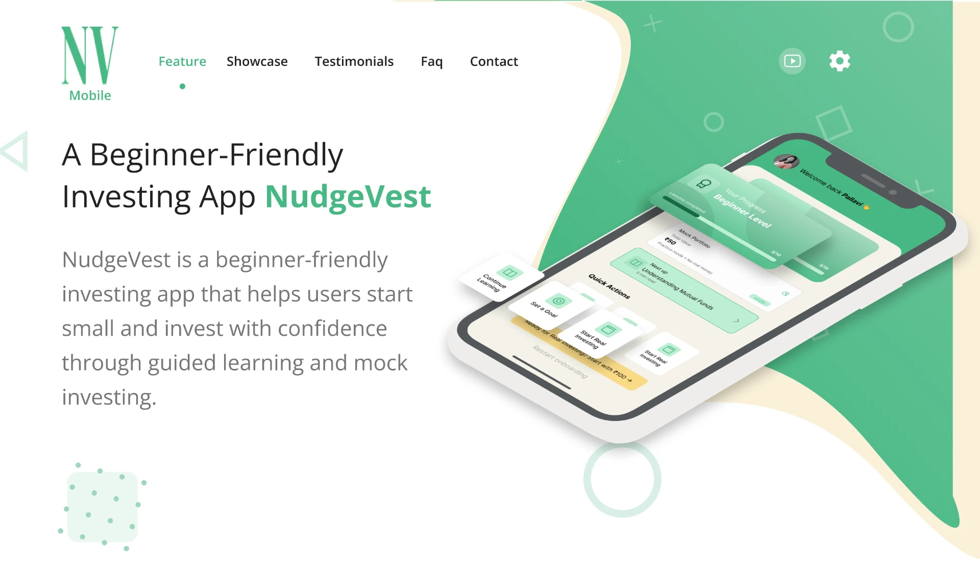
Designing an investing flow that refuses to skip understanding
A finance product where the riskiest interaction is a confident tap on something misunderstood.
First-time investors act on products they do not understand, and existing apps optimise for transactions rather than comprehension.
- Domain
- Personal finance
- My role
- UI/UX Designer
- SOLO
- Pallavi Saple
- Duration
- Approximately 1 month
- Platform
- Mobile
- RESPONSIBILITIES
- Fintech · Comprehension · Decision support
Problem framing
From the requirement to the real problem
- 01 · Initial request
New investors described confidence that did not match their comprehension. They could complete a purchase and not explain what they had bought.
- 02 · Investigation
Standard patterns treat disclosure as a legal artefact placed after the decision, where it changes nothing.
- 03 · Underlying user problem
First-time investors act on products they do not understand, and existing apps optimise for transactions rather than comprehension.
- 04 · Product opportunity
An investing flow that requires understanding before action and explains risk in the user's own terms.
The design position: comprehension belongs inside the flow, phrased in the user's language, before the irreversible step.
Evidence
How I understood the problem
Research methods are listed only where documented. The six-lens framework below is how the problem was interrogated.
I reviewed the existing investing experience and examined how information, risk and disclosures were presented before and during the investment decision. The project also included user research/testing activities, but the exact research method and participant count are not documented in the current case-study material.
The goal was to understand whether users were actually comprehending what they were buying, rather than simply completing the investment flow. The investigation focused on where disclosure, risk information and decision-making were creating friction or being overlooked.
The research/testing material indicates that users could complete a purchase without being able to clearly explain what they had bought. Risk information shown earlier did not necessarily carry through to the purchase moment, percentage-based risk framing was under-weighted, and repeat users could start skimming repeated explanations. These findings led to a stronger focus on comprehension before confirmation, clearer risk communication and progressively shorter explanations for returning users.
What has already been tried here?
Disclaimers, risk questionnaires and glossaries all exist. They are positioned as compliance surfaces, so users route around them.
Where does this live in the user's day?
Decisions are made on a phone, quickly, often prompted by social conversation. The flow had to work under time pressure and small screens.
What forces constrain the system?
Regulatory language cannot be removed. It can be sequenced, summarised in plain language, and paired with the exact moment it applies.
How do the parts react together?
Friction and trust interact non-linearly. Well-placed friction increased perceived trustworthiness; friction in the wrong place read as obstruction.
How does the behaviour actually grow?
Understanding accumulates. Concepts already confirmed are not re-explained, so the flow gets shorter as the user learns.
What can be measured and defended?
A short comprehension check before confirmation gives a defensible measure of understanding rather than self-reported confidence alone.
User insights
Observation → insight → implication
- Observation
Participants could not restate their purchase in their own words after completing the legacy flow.
- Insight
Completing a transaction does not necessarily mean the user understands what they are buying. The experience was allowing users to move forward with confidence that was not supported by actual comprehension.
- Design implication
A three-line 'what you are actually buying' panel sits directly above the confirm action.
- Observation
Risk questionnaires answered up-front did not transfer to the moment of purchase.
- Insight
Generic risk information provided earlier in the journey was not sufficiently connected to the specific investment decision users were making at the point of purchase.
- Design implication
One targeted check on the specific risk of the chosen product.
- Observation
Percentage framing was consistently under-weighted in testing.
- Insight
Users may understand a percentage mathematically without fully understanding what that percentage could mean for their own money. Concrete financial impact makes the potential downside easier to interpret.
- Design implication
Show a plausible downside in currency, not percentages alone.
- Observation
Repeat users found re-explanation patronising and started skimming.
- Insight
The same level of explanation does not work equally well for every user. Once users have demonstrated understanding, repeatedly explaining the same concepts can add friction instead of clarity.
- Design implication
Confirmed concepts collapse into a one-line reminder.
User journey
Where the experience breaks down
Journey stages are placeholders until the documented journey is added.
- 1DiscoverUser action
The user explores an investment opportunity/product and begins evaluating whether it is suitable for them.
User thoughtIs this something I understand enough to invest in?
Pain pointInvestment information and disclosures can be presented as compliance content rather than information that helps users make the decision.
EmotionCurious → cautious / uncertain
OpportunityHelp the user understand the investment before asking them to act.
- 2StartUser action
The user starts the investment journey and encounters information intended to explain the product and its risks.
User thoughtI understand enough to continue.
Pain pointNew investors could complete a purchase and not explain what they had bought.
EmotionConfident → uncertain
OpportunityMove comprehension inside the investment journey, rather than treating disclosure as something separate. “Comprehension belongs inside the flow… before the irreversible step.”
- 3ReturnUser action
A returning user comes back to the investment experience and encounters information they have already understood previously.
User thought“I already know this. Do I really need to go through it again?”
Pain pointNew investors could complete a purchase and not explain what they had bought. Repeat users found re-explanation patronising and started skimming.
EmotionFamiliar → impatient / disengaged
OpportunityMake the experience adaptive to demonstrated understanding. Instead of repeating the full explanation: Confirmed concept → one-line reminder
- 4UseUser action
The user reviews the investment information, considers risk and proceeds toward the purchase/confirmation decision.
User thought“What does this actually mean for my money?”
Pain pointNew investors could complete a purchase and not explain what they had bought.
EmotionUncertain → hesitant → potentially reassured
OpportunityBefore confirmation → Show “What you are actually buying” At the decision point → Ask one targeted question about the chosen product's risk For financial impact → Show a plausible downside in currency, rather than percentages alone.
Product opportunity
Where value, viability and feasibility meet
First-time investors act on products they do not understand, and existing apps optimise for transactions rather than comprehension.
Help users make more informed investment decisions while maintaining the required regulatory disclosures and supporting a trustworthy, sustainable investment experience.
Regulatory language cannot be removed. It can be sequenced, summarised in plain language, and paired with the exact moment it applies.
An investing flow that requires understanding before action and explains risk in the user's own terms.
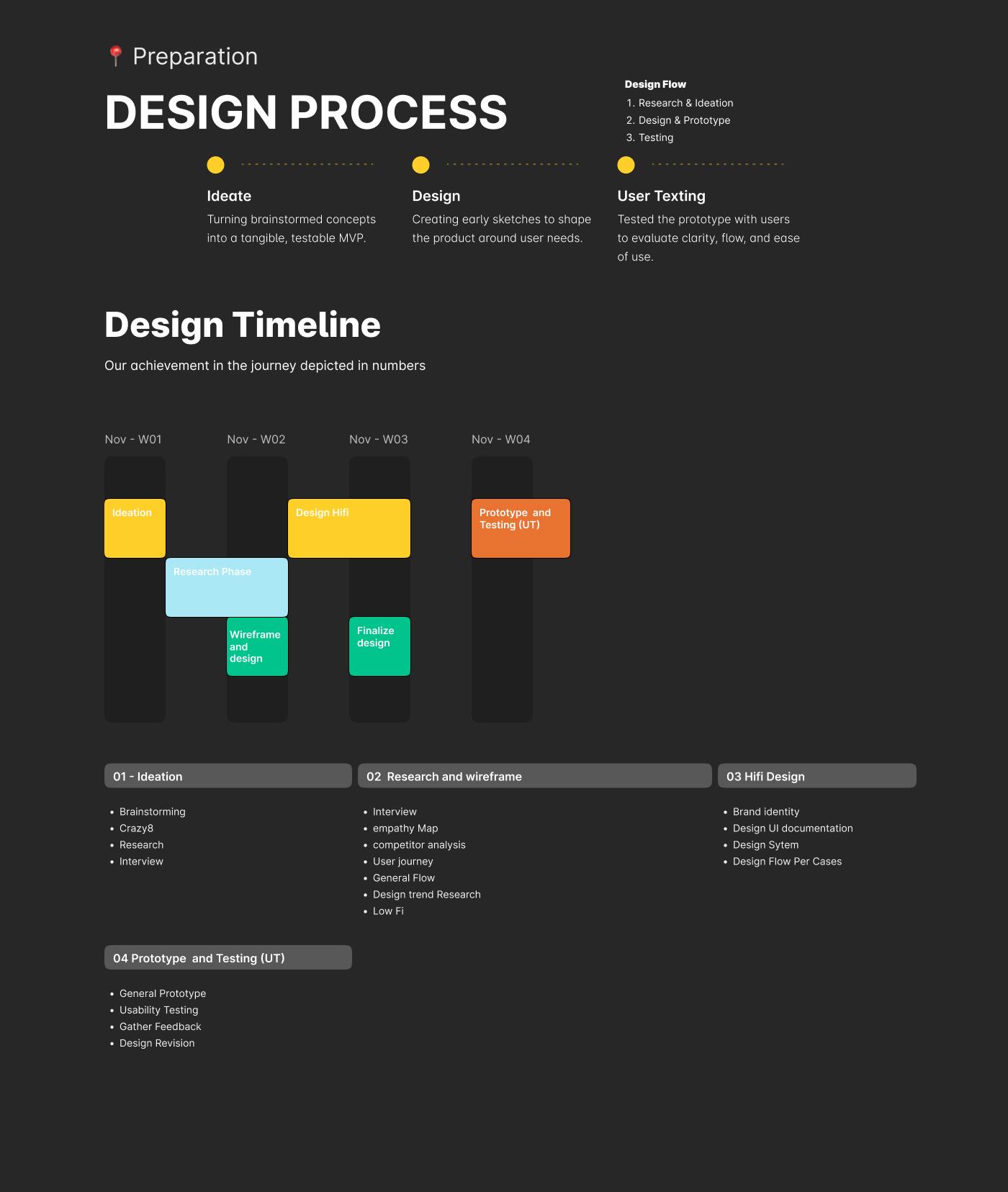
Process
Directions considered, flows and early exploration
Concept A
- What it solves
- We do not currently have evidence showing what the first alternative was intended to solve.
- Strength
- Need to verify what made this direction attractive—for example, whether it improved comprehension, reduced friction, preserved compliance, or was easier to implement.
- Limitation
- Need evidence of what problem remained unresolved.
- Effort / complexity
- Need to verify whether this required: changes to existing flow; new components; additional logic; additional data; regulatory/content changes; engineering complexity.
- User value
- Need to verify the specific user benefit demonstrated or expected.
Concept B
- What it solves
- No documented Concept B description is currently available.
- Strength
- Need to identify why this option was considered viable.
- Limitation
- Need to identify what prevented it from being selected.
- Effort / complexity
- Need to establish whether it was technically/product-wise more or less complex than the other directions.
- User value
- Need to establish the specific user outcome this concept was intended to improve.
Concept C
- What it solves
- No documented Concept C description is currently available.
- Strength
- Need to establish what made this direction promising.
- Limitation
- Need to establish the trade-off or unresolved issue.
- Effort / complexity
- Need to establish implementation complexity and whether it affected the decision.
- User value
- Need to establish the user benefit.
01Plain-language summary before confirmation
- Problem
- Participants could not restate their purchase in their own words after completing the legacy flow.
- Decision
- Place a three-line “What you are actually buying” panel directly above the confirm action.
- Why
- The design position was that comprehension should happen inside the flow and before the irreversible action.
02Comprehension gate instead of another disclaimer
- Problem
- Risk questionnaires answered earlier did not transfer effectively to the purchase moment.
- Decision
- Use one targeted check related to the specific risk of the selected product.
- Product thinking
- Move from “Did we show the information?” to “Did the user understand the information?”
03Explain loss concretely
- Problem
- Percentage framing was under-weighted during testing.
- Decision
- Show a plausible downside in currency, rather than relying on percentages alone.
04Make the flow shorter as understanding grows
- Problem
- Repeat users found repeated explanations patronising and started skimming.
- Decision
- Concepts already understood collapse into a one-line reminder.
- Product thinking
- The experience should adapt to the user's demonstrated understanding rather than treating every user identically.
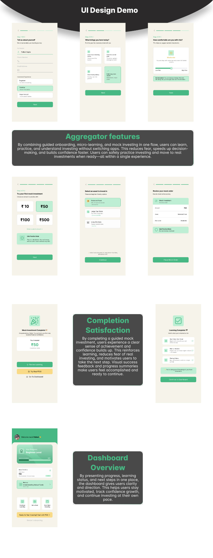
Final experience
The solution
Design decisions
Decisions, not just screens
Plain-language summary before confirmation
- Problem
Participants could not restate their purchase in their own words after completing the legacy flow.
- Options considered
- asking a comprehension question instead of showing a summary
- using a shorter summary versus a detailed explanation
- Trade-off
Balance comprehension with transaction friction — give the user enough information to understand the purchase without turning the confirmation step into another lengthy disclosure screen.
- Decision
A three-line 'what you are actually buying' panel sits directly above the confirm action.
- Why
The design position was that comprehension should happen inside the flow and before the irreversible action.
- Expected outcome
Help users understand what they are purchasing before confirmation, reducing the gap between completing the transaction and actually understanding the decision.
Comprehension gate, not a disclaimer
- Problem
Risk questionnaires answered up-front did not transfer to the moment of purchase.
- Options considered
[DETAIL TO VERIFY]
- Trade-off
[DETAIL TO VERIFY]
- Decision
One targeted check on the specific risk of the chosen product.
- Why
[ADD DECISION RATIONALE]
- Product thinking
Move from "Did we show the information?" to "Did the user understand the information?"
- Expected outcome
[ADD TESTING RESULT]
Explain loss concretely
- Problem
Percentage framing was consistently under-weighted in testing.
- Options considered
[DETAIL TO VERIFY]
- Trade-off
[DETAIL TO VERIFY]
- Decision
Show a plausible downside in currency, not percentages alone.
- Why
[ADD DECISION RATIONALE]
- Expected outcome
[ADD TESTING RESULT]
Shrink the flow as understanding grows
- Problem
Repeat users found re-explanation patronising and started skimming.
- Options considered
[DETAIL TO VERIFY]
- Trade-off
[DETAIL TO VERIFY]
- Decision
Confirmed concepts collapse into a one-line reminder.
- Why
[ADD DECISION RATIONALE]
- Product thinking
The experience should adapt to the user's demonstrated understanding rather than treating every user identically.
- Expected outcome
[ADD TESTING RESULT]
Testing & validation
What was tested, and what changed
- Prototype
- Test
- Observe
- Learn
- Iterate
[ADD TESTING RESULT]
[ADD TESTING RESULT]
[ADD TESTING RESULT]
[ADD TESTING RESULT]
[ADD TESTING RESULT]
Quantitative impact was not measured.
Before → after
- Disclosure placed after the decision
- Risk expressed only in percentages
- Identical explanation depth for every user
- Confidence assumed from completion
- Plain-language summary directly above confirm
- Downside shown in concrete currency terms
- Explanations collapse as understanding is confirmed
- A comprehension check makes understanding observable
Outcome & impact
What changed — reported honestly
An investing flow that requires understanding before action and explains risk in the user's own terms.
Qualitative — intended outcome.
[ADD BUSINESS IMPACT]
[DETAIL TO VERIFY]
Metric to be validated
Research sample
Metric to be validated
Usability sample
Metric to be validated
Task completion
Reflection
What I learned
[DETAIL TO VERIFY]
[DETAIL TO VERIFY]
Friction is not inherently bad design. Friction placed exactly where an irreversible decision happens is the most respectful thing a finance product can do.
If I had more time — next I would explore…
- — Measure comprehension-check pass rates against completion
- — Run usability testing with a documented sample size
- — Test whether concrete loss framing changes allocation behaviour
Team & collaboration
- My contribution
- UI/UX Designer
- Team contribution
- [DETAIL TO VERIFY]
In short
The case study in four lines
- The problem
- First-time investors act on products they do not understand, and existing apps optimise for transactions rather than comprehension.
- The decision
- Plain-language summary before confirmation
- The outcome
- An investing flow that requires understanding before action and explains risk in the user's own terms.
- The learning
- Friction is not inherently bad design. Friction placed exactly where an irreversible decision happens is the most respectful thing a finance product can do.